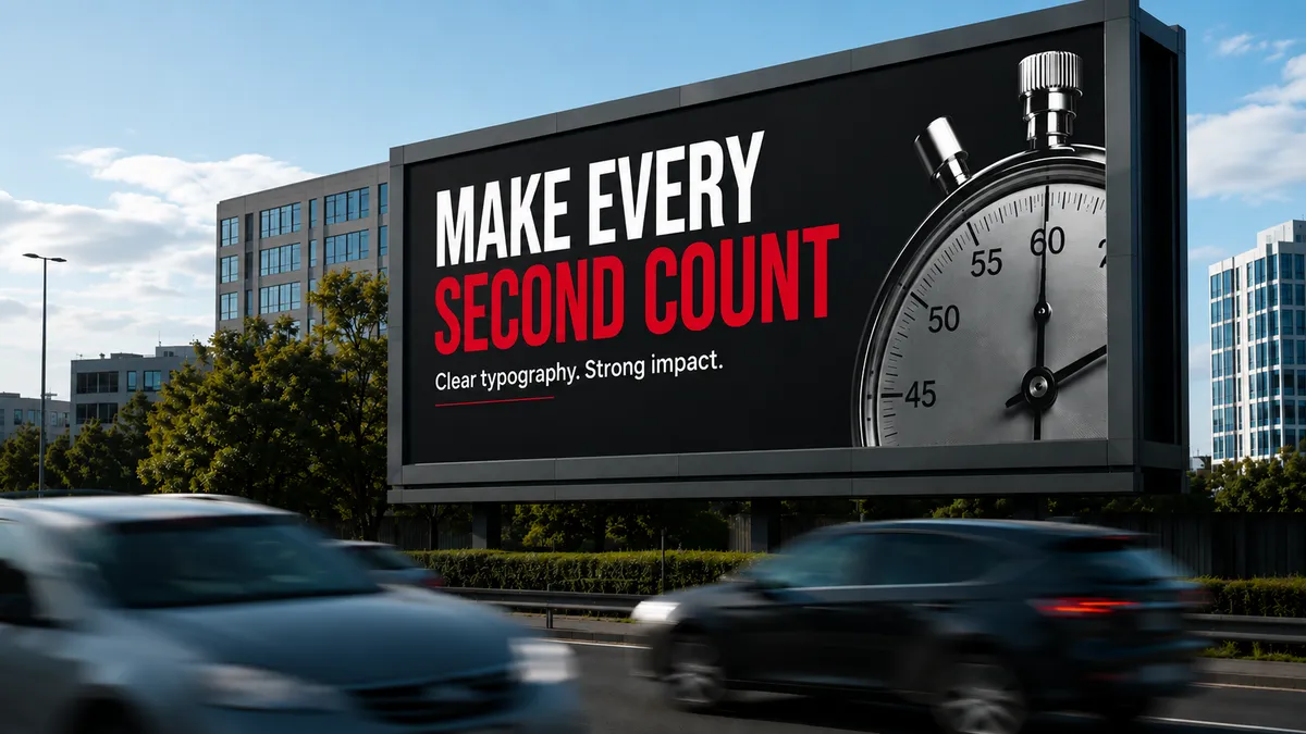
How Typography Impacts Billboard Readability
by Aneesa Umber — 23 Jul 2026
5 minute read
Great billboards make an impact in moments. Whether someone is driving through a city centre or walking past a roadside display, they have only a few seconds to understand the message.
That's why typography deserves as much attention as the imagery. It covers:
- Font choice and weight
- Letter spacing and word spacing
- Line spacing
- Alignment and hierarchy
- White space and contrast
This guide will help you know the typography principles, the environments, the common mistakes, and the psychology behind billboards that actually get read.
People Scan Billboards Instead of Reading Them
A driver has roughly three to five seconds of exposure to a roadside board. A pedestrian glancing up from their phone may have even less. There's no rereading, no zooming in, no second attempt.
Most viewers follow a simple visual path:
- The main image
- The headline
- The brand logo
- A website or call to action
For brands running out-of-home advertising, billboards typography should support this natural journey by making each element clear at first glance.
Typography Begins Before Font Selection
A readable billboard is built on several design principles working together.
These include:
- Font selection
- Font size
- Font weight
- Letter spacing
- Line spacing
- White space
- Colour contrast
- Visual hierarchy
- Text placement
When these elements are balanced, the message feels effortless to read from a distance.
Typography Principles That Improve Billboard Readability
Font Selection
Bold, simple sans serif typefaces such as Helvetica, Futura, and Arial dominate outdoor advertising. It comes down to how the eye recognises letters at speed.
- Open counters: The enclosed space inside letters like 'a', 'e', and 'o' keeps letterforms legible at an angle or a glance
- Generous x-height: Taller lowercase letters read more clearly at distance without needing bigger point sizes
- Consistent stroke width: Very thin strokes vanish in sunlight; very thick strokes blur at speed; a medium-to-bold weight holds up best
Letter Size
Letter height should scale with viewing distance, roughly one inch of height for every ten metres a viewer is expected to be from the board. On a motorway site, this pushes headline text to a scale that often looks disproportionate on a laptop screen but reads correctly once installed.
Weight
Font weight affects how well text survives motion blur, glare, and low light.
- Bold weights hold their shape in these conditions
- Thin or ultralight weights can disappear entirely in direct sun or against high-glare digital screens
Hierarchy
Every billboard has a natural reading sequence, even if the audience never consciously notices it:
- Image or visual anchor
- Headline
- Brand logo
- Call to action
- Website or contact detail
Break this sequence, for example with a logo bigger than the headline, and comprehension drops. The eye doesn't know where to land first.
Spacing
Spacing is where most amateur billboard designs fall down.
- Kerning: Space between individual letter pairs
- Tracking: Overall letter spacing across a word
- Leading: Space between lines
Cramped tracking causes letters to merge at distance. Loose tracking breaks up a word's familiar shape, forcing the brain to process individual letters. Generous margins and breathing room consistently improve recall.
Contrast
High contrast between text and background is non-negotiable. Dark text on a light background, or the reverse, performs best. Subtle colour pairings or text over a busy image might look elegant in a mock-up, but they routinely fail the two-second scan test in real conditions.
White Space
Negative space gives the eye somewhere to rest. It isolates the message from the visual noise that's usually present on a roadside. A single, clear message surrounded by space consistently earns strong recall.
Typography Should Reflect the Billboard Environment
Every location presents different viewing conditions.
Roadside billboards
Drivers have only a few seconds to absorb the message. Large text, short headlines and bold typography deliver the strongest results.
City Centre Advertising
Pedestrians and slower traffic allow slightly more reading time, although concise messaging remains the most effective approach.
Digital Billboards
Digital displays introduce additional considerations such as screen brightness, viewing angles and LED resolution. Bold typography and high contrast help maintain readability throughout the day and night.
Transport Advertising
Bus advertising and other transport formats generate repeated exposure as vehicles travel through busy areas. Consistent typography strengthens brand recognition every time the advert is seen.
Common Typography Mistakes That Reduce Billboards Readability
Each mistake alone might seem minor. Together, they're the difference between a billboard that communicates in two seconds and one that never gets read at all.
Watch out for:
- Using several different font families
- Headlines that are too small
- Decorative fonts that reduce legibility
- Long paragraphs of copy
- Poor contrast between text and background
- Busy imagery behind important text
- Inconsistent font sizes and weights
- Overcrowded layouts
Removing these issues often improves readability without changing the overall campaign concept.
How Typography Influences Brand Perception
Typography shapes how a brand is perceived, often before a single word is consciously read.
- Luxury brands favour elegant serif typefaces with generous spacing, signalling refinement
- Technology brands lean towards geometric sans serif fonts, projecting precision
- Healthcare brands use clean, humanist typefaces to feel approachable
- Financial brands rely on consistency and restraint, projecting stability
Typography decisions should sit alongside brand strategy, not arrive as a late-stage design tweak. A mismatch between typeface and brand personality can undermine a campaign even when every readability rule is followed.
Test Billboard Typography Before the Campaign Goes Live
Reviewing artwork on a computer screen isn't enough.
- Before approving a billboard, check that it:
- Remains readable from different distances
- Stands out in daylight and low-light conditions
- Has a clear visual hierarchy
- Communicates the message within a few seconds
- Keeps branding easy to identify
Small adjustments at this stage can have a significant impact once the campaign is live.
Typography helps people notice, understand and remember your billboard. Clear headlines, balanced layouts and strong visual hierarchy make every impression count.
We can take care of every detail, from typography and creative design to planning and placement. Get in touch with Media Agency Group to help you create a billboard campaign that delivers results, while you focus on running your business.